The Tyranny of the Template: The Graphic Design of the First Edition of ‘Learning From Las Vegas’

Upon its publication by the MIT Press in 1972, “Learning from Las Vegas” was immediately influential and controversial. The authors made an argument that was revolutionary for its time — that the billboards and casinos of Las Vegas were worthy of architectural attention — and offered a challenge for contemporary architects obsessed with the heroic and monumental. The physical book itself, designed by MIT’s iconic designer Muriel Cooper, was hailed as a masterpiece of modernist design, but the book’s design struck the authors as too grandiose for a text that championed the ugly and ordinary over the heroic and monumental.

Out of respect to the authors, the original, gold-stamped, clothbound edition, published in a modest print run of 2,000, was never reprinted. The book that became known to generations of architecture students is the modified second edition, a paperback redesigned by Denise Scott Brown for publication in 1977.
But around 2016, MIT Press’s esteemed editor Roger Conover approached Denise with a proposition: Would she be willing to write a new preface to a facsimile hardcover edition, “saying whatever you want to say about the book’s original design and production”? On the condition that there would be no editing of her text, and that she would have the last word in the case of any editorial differences, a deal was struck. The resulting 2017 facsimile edition reunited the original design with a spirited new preface by Scott Brown, featured below, in which she looks back on the creation of the book and explains her and Robert Venturi’s reservations about the original design.
–The Editors
Early Modern graphics are back. TV’s sassiest talking heads and edgiest ads are supported today by gutsy 1930s sans serif fonts, stark words, and bold Bauhaus colors. In this context, MIT’s decision to reproduce the “legendary” first edition of “Learning from Las Vegas” has met with a near universal “Cool!” So when we call the book’s design “one irony too far” people ask, “What’s their beef?”
Let me explain.
The Las Vegas studio upended sacred cows, refused to view with alarm, would not bad-mouth bad taste, and redefined architectural research. Our views emerged from Early Modern architecture and its postwar Brutalist admirers. These European thoughtways we linked to social protest of the 1960s, American social planning of that era, and emerging attitudes on democratic participation, popular culture, Pop Art, and new roles in architecture for history, symbolism, and communication.
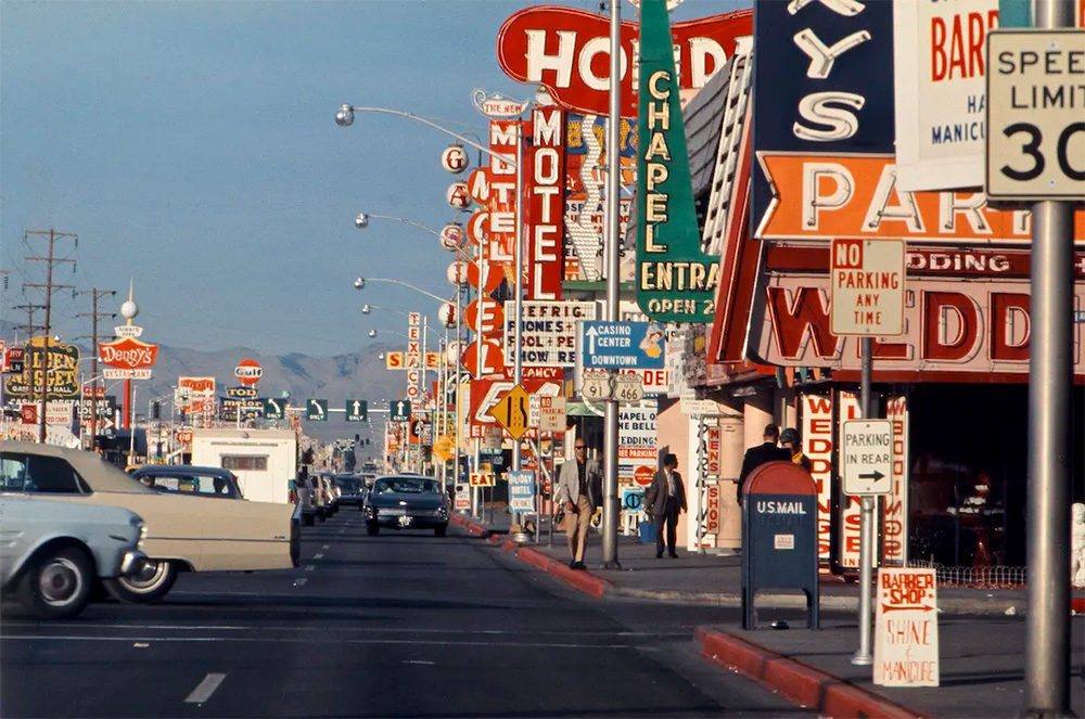
These approaches shared an adversary: post-World War II urban renewal and its architecture, “Late Modern” to its practitioners. To us it was a twisting of Early Modern in search of the heroic and original. We called it “H&O” — ironically, because it brought social harm and urban problems. Against it we posed “U&O,” the ugly and ordinary vernacular of strips and sprawl, universal in America and studied by the LLV Studio in auto cities of the Southwest and the Las Vegas Strip.

Photography was our primary tool. Propounding ideas with a focus as unpalatable as everyday architecture is not easy. We knew it would require showing “what is” before proposing “what should be” and would call for pictures as well as words to explain to ourselves what we were learning, but we soon found that the combination could help others understand our ideas too. And we discovered what every architectural journal knows, that the captions under pictures are the only texts most architects will read. So we chose a medium with generous pictures and generous captions — the photo essay.
The first LLV Studio photo essays were introductory programs that we, as faculty, produced. These described its subject matter and study topics via photographs, graphics, lectures, and written materials. As the students began their research, we made suggestions for execution, and along the way offered help and advice. But soon their own creativity was engaged, and so was Steven Izenour’s. Our student at Penn and teaching assistant at Yale, Steve became coauthor of “Learning from Las Vegas” and a lifetime associate at VSBA. Spending long nights in studio, he advised particularly on films, photography, and production.
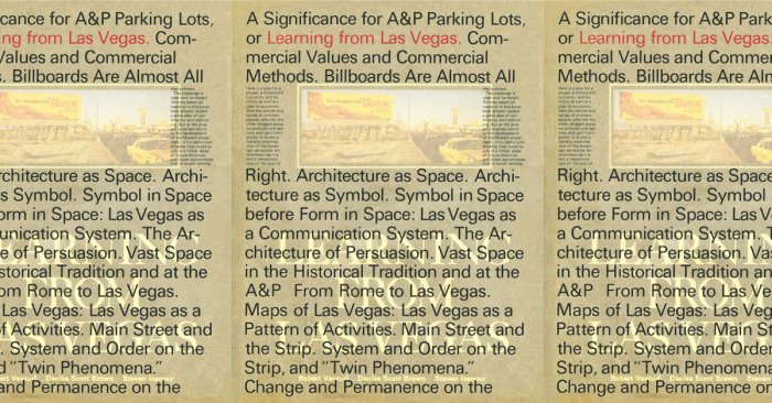
Only on the cover was The Strip revealed as we wanted it, within a format to be read as either a scholarly monograph or a 1940s cigarette-card album, as both pop and high culture.
In writing the book, we outlined study topics, documented research and its results, and added comment, interpretation, and theory in two chapters with Victorian-sounding titles. As the work emerged, its outrageous photos and ebullient maps and diagrams created a hate-love exhilaration that to us conveyed the core of Las Vegas. So we asked the publisher to avoid formats that would restrict or compete with these joyful expressions. To no avail. Only on the cover was The Strip revealed as we wanted it, within a format to be read as either a scholarly monograph or a 1940s cigarette-card album, as both pop and high culture. This melding, our hijinks not theirs, represents our only contribution to the graphic design of the first edition. Muriel Cooper, MIT Press art director, acclaimed radical and renowned graphic artist, chose to design the book herself. In her mind, “Learning from Las Vegas” was to be a salute to the Bauhaus, and she believed we would go well together. But for Muriel, “radical” meant the revolution previous to ours, and, by the early 1950s, aging Modernists were far removed from the Bauhaus we knew. Their Late Modern urban projects, ones we called H&O in the book, brought the Brutalists and others concerned with street life, popular culture, communication, and symbolism to the ramparts. And in 1958, Herbert Gans, Jane Jacobs, and the social planners joined them. I was already there with the Brutalists, but was also, through my South African and Jewish heritage, involved with debates on democracy and the loss of innocence — the ethical roots of Postmodernism. And when Robert Venturi and I met, he was headed there too.
Urban riots in the 1960s complete the story of how Late Modern thought and products became the subject of LLV’s architectural and social critique. But graphic designers of the 1960s clung to the Modernist vision, with its role for them as possessors of a not-to-be-questioned expertise and a revelation that leads “the people” to rationality and freedom. “Would you tell a surgeon how to design a scalpel?” one designer (not Muriel) responded when probed on the legibility of a thin font on a busy train station platform. And here is Muriel on designing for LLV and its authors: “I thought: ‘Boy, this is wonderful material. I’m not gonna let them screw it.’ Hah! You should have seen it! Well, they hated it! I loved it.” Cooper proposed putting a bubble-wrap jacket around the book, in homage to Las Vegas’s glitz — a suggestion we firmly rejected. “What they wanted most was a Duck, not a Decorated Shed. I gave them a Duck,” Cooper ironized. She must have meant the cover, the only place where she gave way. Yet ducks lie in the eye of the beholder. I would have called the cover decoration on the shed. But sadly the rest was anything but a shed.
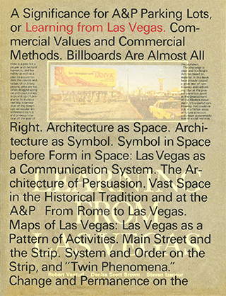
Whatever she did later in electronics, Muriel was in our view a Late Modern book designer who abandoned the vigor of 1930s graphics for a more polite 1950s invention, Swiss Graphics and what went with it. This was the major reason for our disagreement.
However, our first criticisms were of function. The book was big, heavy, difficult to handle at a library table and impossible to read on a bus or carry in a jeans pocket. Sized to the length of The Strip, it had room to display and explain our complex matrices and charts and the leporellos we derived from Ed Ruscha. But although The Strip will pop your eyes out, nowhere was it shown in large colored pictures. Its postage stamp color shots, too small and too muddy to convey neon 22 stories high or the glint of glaze on a Roman centurion, limited our ability to make our argument.
Such cramping compositional directives I called the Tyranny of the Template. Its major limitation was a high ratio of background space to foreground content, favoring white space over picture size and content visibility. Blocks of text were proportioned to the white space more than to the illustrations. These, and the small Helvetica fonts preferred by Muriel, made our texts too short to fill the blocks. To keep pace with the illustrations they referred to, text lines had to be triple-spaced and words stretched widely on them. This guaranteed an uncomfortable read and a book design that T. S. Eliot might have called a “periphrastic study in a worn-out poetical fashion.”
That our argument against Late Modern was couched in Late Modern graphics conveyed, to say the least, a mixed message — “one irony too far,” I said. We argued mightily with Muriel. “Why, when we’re criticizing the use of H&O as a panacea for everything, would you use it for our book? How confusing for readers!” At a meeting in the MIT Press library, Bob gestured toward the shelves: “You could use the graphics of any one of your technical books and we wouldn’t complain.”
No one at the Press agreed, but we were allowed to reject the bubble-wrap cover — how could that have denoted a block-long animated neon façade? However, Muriel, distressed by our “scholarly” cover, concealed it in a glassine, Helvetica-bedecked dust jacket. Yet she did not dare hide our inset picture of a desert billboard cum triumphal archway, from which a near-naked female calls “Tan Hawaiian with Tanya.” So she broke her text where the axially placed Tanya was, to leave her visible under the jacket. We hated the glassine fig leaf, its spindly font and H&O aspirations, but the semi-avoidance of Tanya made it even worse. (Nevertheless, the jacket, where it survives, adds to the selling price of the book.)

To be fair, the first edition sold well, though partly through the publisher’s subvention. And by placing the work programs, especially the urban ones, beside their products, this edition reminds readers that Southwestern urbanism was as important in our study as signs, symbols, and communication. And its comparisons of maps and pictures would have been useful had their color been accurate.
The end section illustrating our work is a happier story. Early projects look good in color here. They mark our transition from academe to practice, and the joys of “learning from” — of applying in design what we had awakened to in research. Some professional journals see illustrating your ideas through your work as unacceptable egoism. We feel that describing your thought processes and methodologies as you design, showing how you took the crucial yet taxing steps from analysis to synthesis, is a good way to explain your work. It’s a particular kindness and reassurance that practitioners can offer students, and it need not be an act of vanity. In any case, your own work is what’s available in your files and what you know best.
One project illustrates a sad fate of some new ideas — killing by old revolutionaries. Here the victim was our design for the Transportation Square office building in Washington, laid low by Gordon Bunshaft and the Washington Fine Arts Commission. The worst of their exchanges, those where the assassinations occurred, we recalled from memory, as certain Commission meetings were declared “executive sessions” — no press admitted — and their records were not available. But they are now. And so is a legal scholar’s assessment of the “Star Chamber” proceedings we endured. It’s in the LLV appendix. Sadly, the issues of equity and justice, let alone effectiveness and probity in design review, still need intelligent cogitation.
Several years after the first edition of “Learning from Las Vegas” appeared, our editor, Barbara Ankeny, called with a surprise. More copies of the book were needed, but the unsubsidized cost would be prohibitive. Would we approve a revised version, priced for students, resembling other books in the Press library, and with considerably less white space? And would we like to design it? Would we!
Our small, cheap, readable, U&O book is skimpy, but its ethos is right. It follows the graphic principles of our first edition cover: be deadpan, don’t upstage your subject, and (in the way Bob wears Brooks Brothers suits) present outrageous content in a conventional format. The revised edition took six months of my life, but it has stayed in print more than 40 years and been read by generations of students and architects.
Yet its graphic design produced other problems. A cost-saving measure placed our work programs together at the center of the book and away from their products. This underlined the identity of the studio and its value as a model for research today. But our topic work programs, already strongly abridged, were now disconnected from the maps, images, and texts that described our analyses and syntheses. This downplayed our findings on emerging automobile cities and undercut our claim that we were “evolving new tools: analytical tools for understanding new space and form, and graphic tools for representing them.”
Yet automobile cities have been as important to our work as the architecture of communication, and in this sense the first edition reflected priorities missed later. But the second, despite its size, achieved greater clarity and better comparability of illustrations, partly by altering the template and reducing the amount of white space. In revising our graphics, I remembered Eliot’s line, “the poetry does not matter,” and how he ransacked the unpoetic to find a poetry for our time. And in learning from urban ideas of complexity and our experience “curating” slide lectures, I aimed to make points rather than look pretty.
Our urban interests were not edged out when schools introduced their own research studios. In fact, urban activity and land use maps were the first to be adapted from our topics. But there are many more research ideas to quarry from LLV, and in our practice we have adapted themes from Southwest urbanism, the Penn planning program, and Princeton Beaux-Arts analytiques — for use in architecture.
So some good came from the first edition. And welcome to its reissue, which provides opportunities to rethink what’s appropriate today to H&O, and what’s to be gained, post-NeoMo, and most of the time, from U&O — that modest, mannerist, wily dodger.
Denise Scott Brown is an architect, writer, and planner. She and Robert Venturi are founding principals of the influential architectural firm Venturi, Scott Brown, and Associates (VSBA), whose work and ideas have influenced generations of architects and planners. This article is excerpted from the facsimile edition of “Learning From Las Vegas.”


